The Good, The Bad & The Ugly
E-Commerce has been one of the fastest growing markets of the 21st century with every retailer now offering online or multi-channel platforms to sell their products.
Retail websites are no longer perceived as a secondary selling tool; they are quickly evolving into one of the most proficient touch points of brand to customer experience. This can be just as profitable as a high-street store. ‘The Good, the Bad and the Ugly’ explores website functionality from some of the best in the business, offering ideas and improvements of how to develop their online customer experience. Based on a user-perspective, we will be following M&S, H&M, ASOS and Topshop looking into their use of text, imagery, special features, key mistakes and how to avoid replicating these online.
Brands we will cover:
(click on a brand to go straight to their reviews)
Marks & Spencers
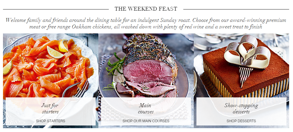
The Good
M&S have created an appropriate feature for customers using visually appealing and well sized imagery. This could be improved by scroll over features; for example, when scrolling over the roast beef image an image of Yorkshire puddings may appear.
The Bad
The white overlay boxes should be reduced in size as they hide the imagery behind them. 'Just for starters' should ideally fit on one line to accommodate a smaller box
The Ugly
The italic text is unnecessary, difficult to read and adds very little to the feature. Utilising a simpler font with an attention-grabbing headline would be more effective such as, "Delici ous roast-inspired meals without having to lift a finger".
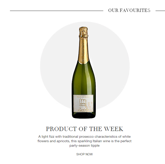
The Good
An attractive feature which offers a simple yet effective approach to selling a particular product or offer. Choices
of fonts are easy to read and information is kept minimal to let the product take centre of attention.
The Bad
This must be regularly updated in order to appear current for regular site visitors. It's easy for site managers to neglect this task, and could result in customer disappointment with the website.
The Ugly
'Shop Now' should also feature a 'Buy it Now/Add to Basket' option to reduce the time it takes to get the product into a shoppers cart. This may be created with an appropriate basket/shopping cart image to reduce the use of text on the feature.
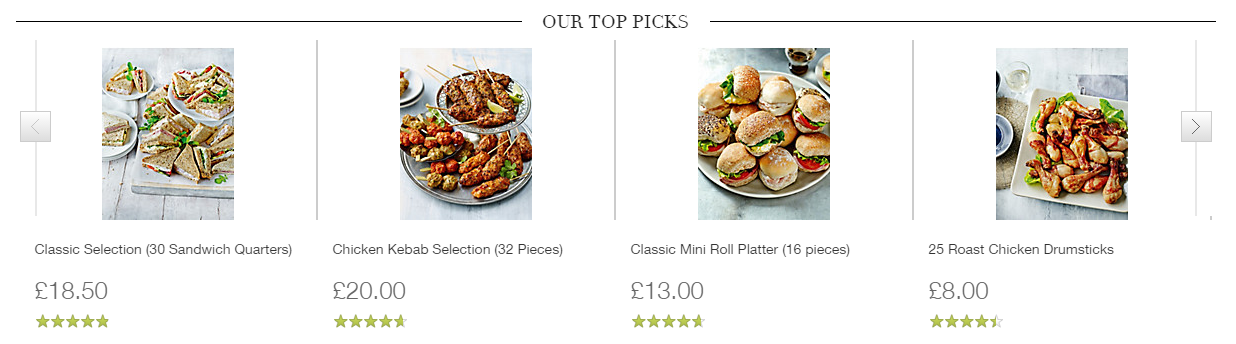
The Good
A great example of up-selling where M&S have used an appropriate style of imagery that fully advertises the products
to their potential. The font is easy to read and the prices are made visible from their size.
The Bad
Images should ideally be landscape to utilise the entire space between products. M&S may also consider adding close-up, detailed imagery when scrolling over the product to enhance a shoppers desire to purchase.
The Ugly
The feature lacks a 'buy it now/add to basket' option which this would reduce the number of clicks between the page and shopping cart. It's important to remember that no customer shops in the same way; some may wish to gather information from the product page before purchasing, whilst others may compulsively shop and wish directly add to basket. Occasionally, the journey from clicking to product page and reading information may hinder a compulsive shopper's desire to buy, in which case adding a buy it now feature would eliminate this customers hesitance to purchase.
H&M
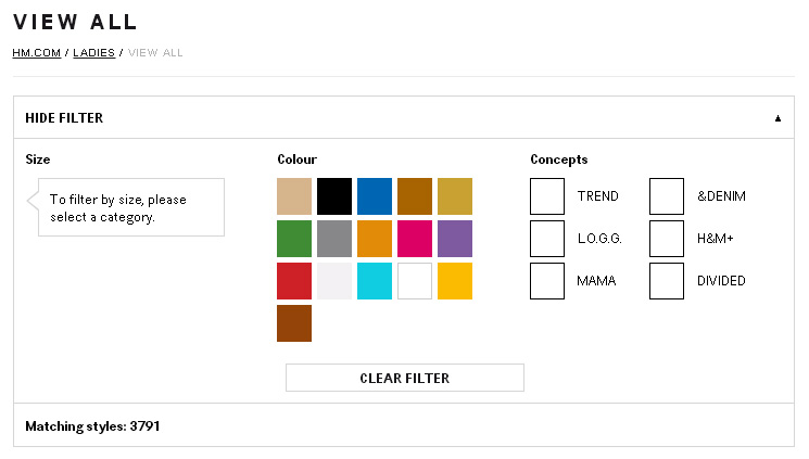
The Good
A simplistic way to offer feature filter options to your customer. H&M have developed a more minimal and visual
approach to creating convenient shopping online.
The Bad
The shades of particular colours may hinder customers from searching in that particular
The Ugly
The colours are confusing and non-representative of the actual physical product.
The Good
Successfully draws attention to that particular product and breaks up the page layout.
The Bad
The larger scale image allows the shopper to have a better view of the product; from this the smaller images to the left now appear to not display their products as effectively.
The Ugly
The featured product should ideally be an inspirational 'hero piece' or exciting item that sets the mood for the rest of the products. It may be an option for the customers 'recently viewed' products to feature within that space
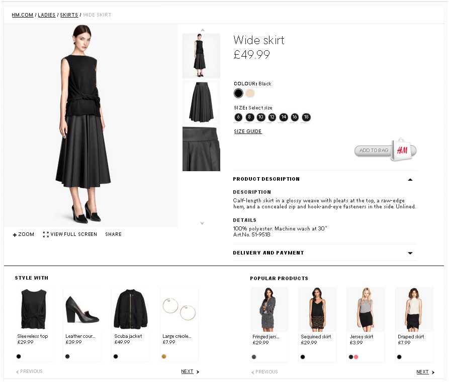
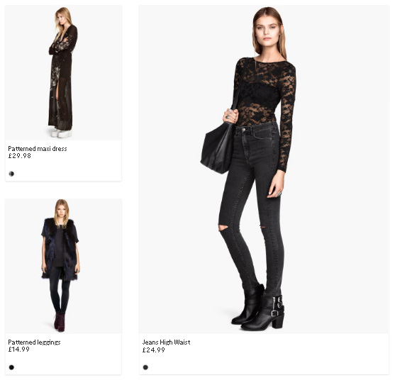
The Good
Quite often shoppers are enticed to click on products if they are attracted to the entire outfit. H&M style their
models well; the 'Style With' features gives shopper the option to purchase the entire displayed outfit - a successful
example of up-selling.
The Bad
The 'Popular Products' feature is biased and does not relate well to the original item. Two up-selling features on one product may be not only confusing but annoying for the shopper, especially if the products are irrelevant to their taste. H&M could potentially move this up-selling feature to the 'shopper’s basket' page where it may have more effect on shoppers.
The Ugly
The 'Add to Bag' button is not particularly visible on the page. As well as this, appearances of the option selectors are insufficiently designed and lack competence which may reduce shopper confidence in the website
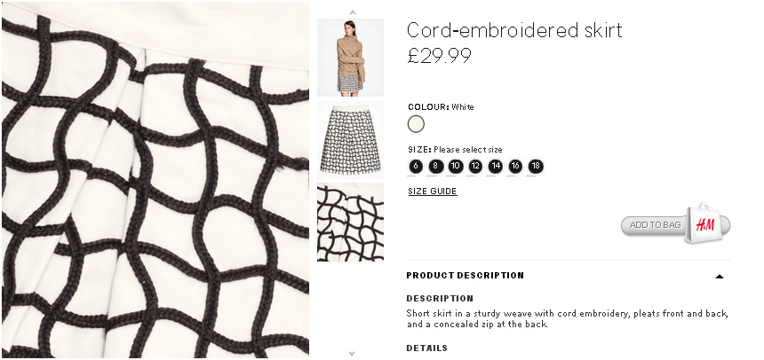
The Good
Close ups on products are a great tool to allow shoppers the understanding of how that product may feel or touch.
The Bad
The close-up feature would work better if it could show more of the product, rather than just what's in the current close-up.
The Ugly
Little care and consideration has been made when preparing the skirt as the zoomed image clearly shows lack of sufficient garment finishing and an ultimately low-quality product. It's important to recognise that whilst the price and quality is reasonably low, this does not suggest the customer is to purchase a faulty item, therefore extra care should always be taken to ensure the product has no faults before being photographed.
ASOS
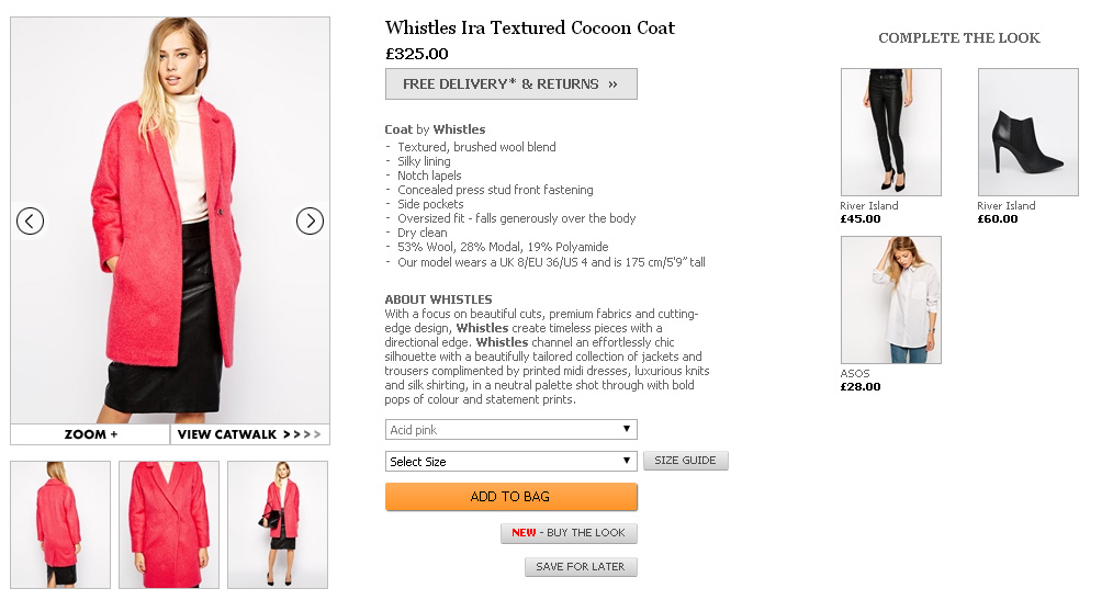
The Good
A well designed page with lots of great features: 'save for later' option allows customers to create a wish list
of items, sufficient imagery for the customer to understand the product, 'view catwalk' option to give a greater
product understanding, text in bold such as 'Whistles' and 'Coat' will direct you to their pages and most importantly
the 'add to bag' button is made very clear.
The Bad
The catwalk option features music which some customers could find an unnecessary addition.
The Ugly
The images under 'complete the look' do not match the models outfit. Rather than becoming a helpful feature for the shopper, it becomes a blatant up-selling tool which some shoppers might find annoying. Similarly, the 'new - buy the look' button is not longer seen as a convenience but rather a way for ASOS to shift their stock.
The Good
A quick and useful way for shoppers to refine their search without having to use the left-hand-side 'refine by' feature.
The Bad
The links to product have potential to be slightly larger in font size to make it easier for customers to notice.
The Ugly
The entire site is filled with colourful graphics and imagery yet navigation tools that would benefit their customers appear as a second thought. A banner, small imagery, or use of colour would make this feature stand out on the page. ASOS have added this feature with a purpose however, is there any use in creating something that is unnoticeable and unused by shoppers?
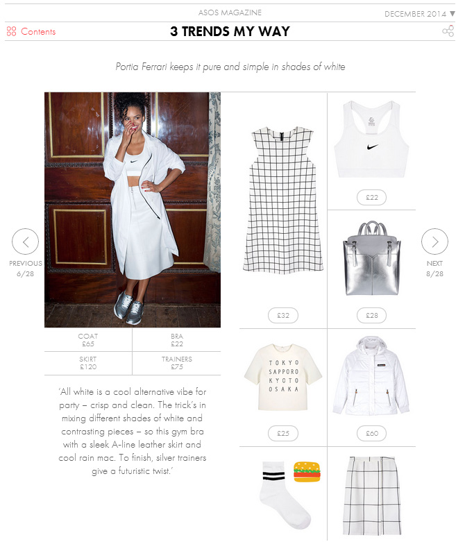
The Good
An exciting editorial feature offers an efficient way to promote your products to customers rather than them having
to search through the website to find that item. Here ASOS have devised trends with selected best-selling items
and once clicked takes you directly to the product page.
The Bad
The layout of the page means customers have to scroll quite far down to see the rest of the featured products, and a lot of the left-hand-side is left blank and unused.
The Ugly
ASOS are missing out on potential sales here and forget the useful features they have employed on other pages. They may consider offering an 'add all to basket' option under the model image which would make it more convenient for the shopper and an effective marketing tool
Topshop
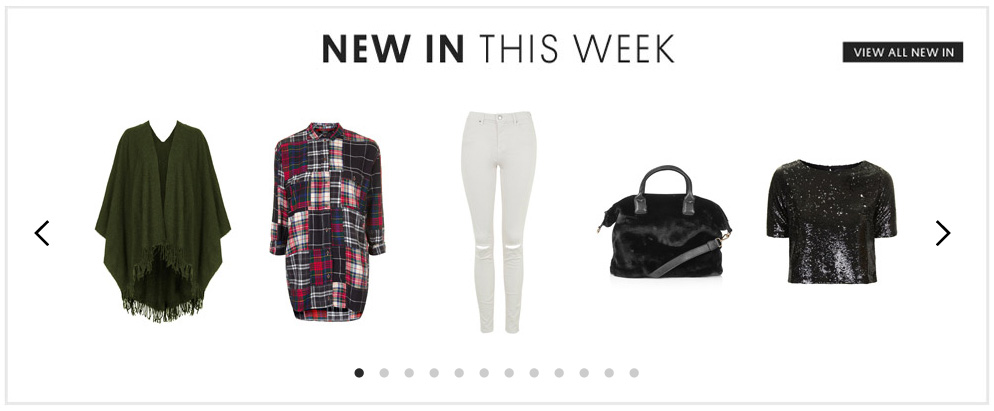
The Good
A more visual feature to illustrate new products for customers rather than a employing a 'new item' category.
The Bad
Only 12 products are displayed; Topshop may consider featuring more products due to the size of their company and their constant supply of new garments each week. The size of a company and their regularity of new products should decipher how they utilise a feature such as this.
The Ugly
The customer must click the arrows 12 times in order to get through each product. A much more time-saving # feature would be for 5 new sets of items to appear during each click; this would consequently optimise its efficiency in displaying more products.
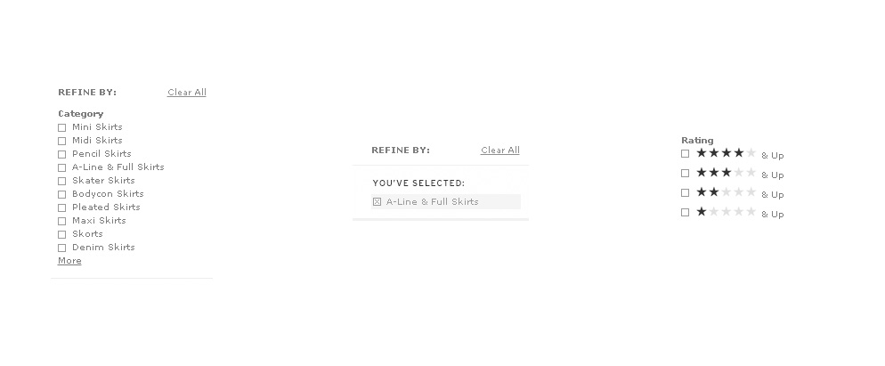
The Good
Refinement options are ideal for the busy shopper who desires convenience from online browsing. Topshop's feature offers refinement in category, size, colour, rating and price, all of which are the most important product factors for a shopper.
The Bad
Whilst rating is important for any customer, it's also a hindering factor for your business. It's extremely unlikely any shopper will actively choose to search for 1* rated items, it's much more likely that they will avoid these products. Topshop may consider removing this refinement category as it's essentially obstructing the sales of those products.
The Ugly
Upon selecting your refinement, the shopper can only view products from that particular category, e.g. A-Line & Full Skirts. It's not uncommon for shoppers, particularly women, to desire to shop for multiple styles, colours and sizes therefore this type of selection makes it less convenient for the shopper as it lacks the option of variety.
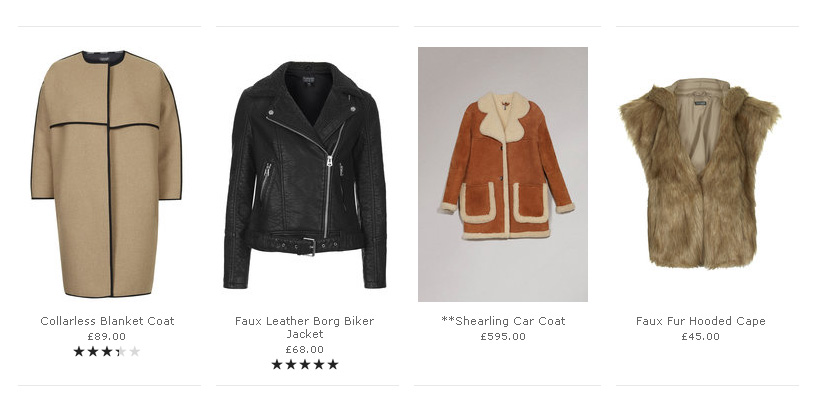
The Good
The majority of products are well photographed and clearly show the product and the way in which they would be worn on the body; which is after all what the end-use of the products will be.
The Bad
Inconsistency in product imagery not only makes the page less attractive but also gives the impression of an incompetent and uncared for website. The use of background colour and lighting does not in any way improve the Shearling Coat product but makes it less inviting to look at.
The Ugly
The biggest flaw in this feature is the £595 price tag of the item. It makes sense for a much more expensive, luxury product to have additional features, text or distinctive photography to make it stand out against the other items. In this case, the item fades into the background which is likely a negative impact on its sales.
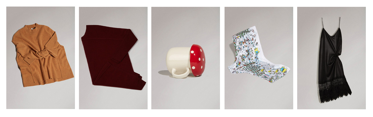
The Good
The page features a visual differentiation from the rest of the site which may imply to customers that these products are specifically designed for Christmas (rather than random products already available being randomly added to their gift ideas category).
The Bad
These products come under the Christmas Gift Finder category of the website; but this hardly made apparent from the grey and dimly lit background. Topshop could have featured very subtle Christmas graphics such as transparent snowflakes on the page to reinforce the Christmas category to the consumer.
The Ugly
Customers may question why placing a mug on its side or folding underwear into a right angle will make a product seem more desirable. Brands often wish to differentiate themselves in the way they display products as almost every website uses (ghost technology with white background). However, this technique is widely-used for a reason; it displays the product in the most effective and easiest way for the customer to understand what they're purchasing. In this case, Topshop have unsuccessfully tried to offer differentiation that neither improves the product appearance nor makes it any more desirable.
The Conclusion
The key to excellent website functionality is simply understanding your customer and how to shape your online experience around their expectations and needs. Leisurely browsers will appreciate up-selling features and product recommendations, whereas shoppers in a hurry crave a site designed upon efficiency and to make their purchase in as few clicks as possible. It’s also worth noting; the bigger the brand doesn’t always mean the better their website. Make your company stand out against the competition with a little help from our Evance software…
Get the knowledge and inspiration
Get the knowledge and inspiration you need to build a profitable business — straight to your inbox.
Unsubscribe any time! / Privacy Policy